Our Work
What We Do
Articles
Open Source
Details
About Us
Blog
Contact
Our Work
What We Do
Articles
Open Source
Details
About Us
Blog
Contact
Bringing Data to Life
VIEW THE PROJECTS
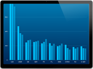
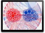
POLITICAL INFLUENCE
POLITICAL INFLUENCE
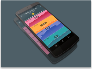
MOBILE FINANCE
MOBILE FINANCE APPLICATION
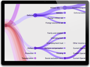
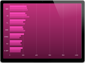
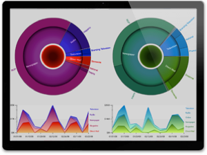
FEDERAL BUDGET
2013 FEDERAL BUDGET
VIEW ALL PROJECTS
Project Gallery
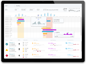
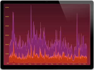
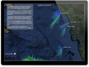
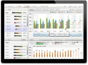
Storm Sensor Dashboards
D3 Mobile Web Application
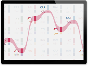
NFL Predictions
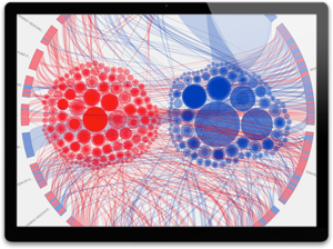
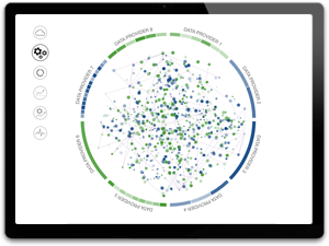
Political Influence
Federal Budget
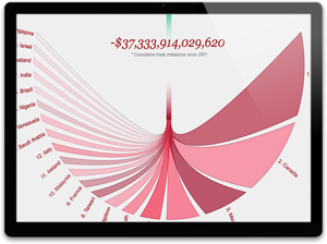
United States Trade Deficit
Product Introduction
Vizuly Scatter Plot
Vizuly Line Area Chart
Vizuly Bar Chart
Vizuly Column Chart
Vizuly Corona
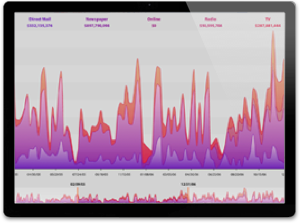
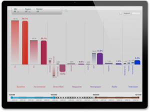
Marketing Decomposition
Marketing Contributions
Swell Watcher
ERP Mockups
Marketing Volume
[gravityform id=”1″ title=”true” description=”true” ajax=”true”]
×

 POLITICAL INFLUENCE
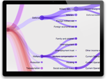 FEDERAL BUDGET