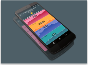

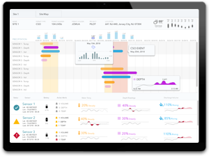
 POLITICAL INFLUENCE
 FEDERAL BUDGET
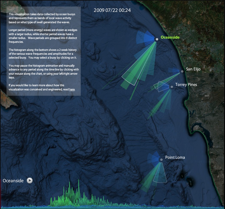
Swell Watcher
This visualization takes data collected by ocean buoys and represents them as bands of local wave activity based on what type of swell generated the waves.
Longer period (more energy) waves are shown as wedges with a larger radius, while shorter period waves have a smaller radius. Wave periods are grouped into 9 distinct frequencies.
The histogram along the bottom shows a 2 week history of the various wave frequencies and amplitudes for a selected buoy. You may select a buoy by clicking on it.
You may pause the histogram animation and manually advance to any period along the time line by clicking with your mouse along the chart, or using your left/right arrow keys.
This visualization requires Adobe Flash.
[+] Click to Launch High Fidelity Project
zoom [+] Click to Launch High Fidelity Project
Dear Sir
How you can create this type of extension. can you use jquery for creting this type of project. and i am use this type of extension in QlikSense