
 POLITICAL INFLUENCE
 FEDERAL BUDGET
Building Reusable Data Visualization Components for a Modern Web

This is part two of a two part series discussing why and how to build reusable data visualizations components. In Part One, I discussed what a reusable component is and how it can make your workflow more efficient and enjoyable. I also discussed what architectural aspects of reusability would be of value in a lightweight component framework for both prototype and production level data visualization components.
In Part Two, I will be discussing in detail how you can build reusable visualization components for yourself using an open source framework that I have developed.
Full Disclosure: the open source code I reference in the examples below is part of a software offering I have built called Vizuly. Vizuly is primarily an ultra lightweight open source core framework and set of both standard and advanced charting components. While all of this code is open source, I also provide commercial level support and framework adapters for sale to organizations. For many in the open source community, any hint of commercial affiliation can raise eyebrows. This is why I have released all the code discussed here under an open source MIT license which allows you to do what you want with it — even sell it if you so choose.
My goal in writing this article is to help teach other people how to build their OWN data visualization components, and benefit from the lessons I have learned over thousands of hours thinking through this framework and building out components across various commercial client projects over the past couple years. What you are reading is a distillation of this real-world experience summarized in a format that should help transfer this knowledge to other data visualization practitioners.
Below I will walk you through the process I followed in building out vizuly from its conception, to its implementation, and the resulting details that are used to quickly prototype and develop unique and robust visualization components.

The first step in building out this framework was to sit down and design what I wanted the end result to look like, from a developers perspective. Much like a visual designer will hand mockups off to a developer team, I wanted to design the interface a developer (mostly me) would work with when implementing one of these components in an application. Taking inspiration from the article “Towards Reusable Charts” by Mike Bostock (creator of d3.js), I put together some example code of what I wanted the finished API to look like from the perspective of an application developer using one of these components.
// Creating a new component
var viz = new BarChart('#myBarChartDiv');

// Setting a property
viz.data(myData);

// Setting a style
viz.style('bar-fill', 'red');

// Listening for an event
viz.on('click', myClickHandlerFunction);

/ Listening for a property change
viz.onChange('width', myWidthChangeFunction);

// Modifying a component externally with d3.js
viz.on('updated',function({
 viz.selection()
 .selectAll('.bars')
 .style('opacity',0.5)
});
Now that I had a good idea on how I wanted the API to look, I set about architecting a solution. Javascript is a pretty unique and powerful language in that it is loosely typed, and EVERYTHING except its primitives are considered an object, including functions. You have the freedom to structure things pretty much anyway you want. This can be both good and bad. With no discipline or adherence to rudimentary best practices, javascript code can spin into an unmanageable mess. But, with a bit of judicious forethought, you can do some really cool things architecturally and make something clean and elegant.

To provide the API described above, while still being able to quickly spin up prototype visualizations without writing laborious boilerplate, I ended up settling upon a Factory Pattern. Simply put, a factory pattern provides a method by which you can pass in one or more parameters and it will return a functional object based on the parameters you sent to it. What I like about this pattern, is that I could hand off the tedious boilerplate tasks to the factory method without having to write that code each time I wanted to make a new visualization component. By passing in a terse configuration object the factory would set up all the public property setters/getters, event dispatchers, and provide some useful functions to help manage dynamic styles as well as other helpful utilites.
For now I am going focus on how we can use this factory method to create a component.
The inner workings of the factory, while not overly complicated, are beyond the scope of this article. But if these details interest you feel, free to grab the source code which are here on github.
I am now going to walk you through the steps of creating your own simple bar chart component from scratch, starting with a shell component and then flushing out the inner lifecycle functions so we can render something that looks like this.
While this takes just a little more code than if you just whipped together a prototype or copied and pasted a D3 example, I think you will find the overall time savings and improvement to your development workflow well worth it.
Here is an abridged version of what the source code for the bar chart will look like. Like the Bostock article referenced above, we are going to create a component as a function that accepts a parent DOM element, we are also going to provide a way to set properties, styles, events, and stub out the component lifecycle methods using our factory pattern.
var MyBarChart = function(parent) {
// scope variable - our factory configuration object
   var scope = {
      properties = {
         'data': null,
         'width': 300,
         'height': 300,
         'margin': {top: 20, left:50, right:20, bottom:20},
         'padding': .3,
         'xValue': function (d) {
            return d.y
         },
         'yValue': function (d) {
            return d.x
         }
      },
      styles: { 'bar-fill': '#777' },
      events: ['click']
   }

   // Call our factory method to create our component
   var viz = vizuly2.core.component(parent, scope);

   initialize();

   // Object lifecycle method stubs
   function initialize() {}
   function measure() {}
   function update() {}
   function applyStyles() {}

   // Publicly expose update function
   viz.update = function () { update(); }

   // Return our factory created object
   return viz;
}
For simplicity sake I have only included a few properties, styles, and events, and left the object lifecycle functions empty. As you can see though, this isn’t a whole lot of code and things look pretty clean. The important line of code to notice is the linevizuly2.core.component(parent, scope)This line uses the core.component()factory method to generate an object that supports the properties, styles, and events we declared with our scope variable that allows us to do something like this from within our application:
var chart = MyBarChart(document.getElementById('myElement'));
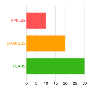
chart
.data([
{label: 'apples', value: 10},
{label: 'oranges', value: 20},
{label: 'pears', value: 30}
])
.width(600)
.style('bar-fill', 'green')
.on('click', myClickHandlerFunction)
.update();
You will notice in the properties object we have a data, size, and marginproperty in addition to a padding, xValue, and yValueproperty which are unique to our bar chart. The paddingproperty will be used to set the bar padding (space between bars), and the xValueand yValuefunctions will be used return the proper x and y values for a given datum in our dataset — this helps keep our object a bit more flexible to the data being passed into it, as we can dynamically declare what datum properties to use for rendering and not rely upon hard-coded data structures.
At this point our chart doesn’t do anything, as we have just stubbed out the object lifecycle functions. So now let’s start to fill in some of these functions to see how we can build this bar chart. For these examples we are going to use d3.js to append and update objects to the DOM, using the parent element that was passed into the components creation as a container for these additional elements. If you are not familiar with d3, this code may look a little foreign, and while this article is not a d3 tutorial I will do my best to explain the basics needed to implement the bar chart.
First, we are going to add a few component scoped variables that we will want to be able to access from one or more object lifecycle functions. So we will add this to our MyBarChart code above our initialize()function and then initialize our component by adding the appropriate DOM elements we will render to.
// Dom elements we want to add
var svg, plot, leftAxis, bottomAxis;

// Scales and Axis - using d3
var yScale = d3.scaleBand();
var xScale = d3.scaleLinear();
var xAxis = d3.axisBottom();
var yAxis = d3.axisLeft();

// Holds measurements based on width, height, margin
var size;

function initialize() {

    svg = scope.selection.append('svg');
    plot = svg.append('g').attr('class','plot');
    leftAxis = svg.append('g').attr('class','left-axis');
    bottomAxis = svg.append('g').attr('class','right-axis');
    scope.dispatch.apply('initialized', viz);

}
As you can see above, we have added 4 main DOM elements using the d3 appendmethod which simply adds a child object to the parent object much like the node.appendChild()does in javascript. We have an SVG element to render to, and then within that SVG element 3 other elements, a plot to draw the bars to, and two axis elements for the left and bottom axis. The scope.selectionvariable is returned to us in our vizuly2.core.componentfactory method and is a d3 selection we can append DOM objects to. We also add class names to each of these elements, so at any point we can easily query these elements from outside the component, which we will talk more about later. Finally, we use our scope.dispatchto emit an event indicating the initialize()function has been completed and provide a hook for developers to intercept should they want to interrupt the object life-cycle after the component has been initialized.
Now that we have our main SVG place holders that we will be rendering to in our update()function we want to use the measure() function to set up our scales and make any other needed measurements. It should be noted that when the vizuly2.core.component()automatically creates setters/getters for all the declared properties it will also append the resulting values to the scopevariable that was passed into it to provide internal access to these variables.
function measure() {

   // Make sure all of our public properties are set
   viz.validate();

   // Get our measured size
   size = vizuly2.util.size(
    scope.margin,
    scope.width,
    scope.height,
    scope.parent);

   var maxX = d3.max(scope.data, scope.xValue);

   var yDomain = scope.data.map(function (d) {
      return scope.yValue(d)
   });

   yScale.range([0, size.height])
    .padding(scope.padding)
    .domain(yDomain);

   xScale.range([0, size.width]).domain([0, maxX]);
   xAxis.scale(xScale).ticks(8);
   yAxis.scale(yScale).tickSize(0);

   scope.dispatch.apply('measured', viz)
}
In the above measurefunction we first call the viz.validate()method which validates all of our public properties have valid values, and issues a developer friendly error if they don’t, then we call vizuly2.util.size()which automatically returns a size object with the appropriate width, height, left, right, top, bottom measurements based on our scoped width/height and margin object. This sizevariable becomes useful in other functions as well, as we don’t need to constantly recalculate margins etc. For additional convenience the vizuly2.util.size()function can also calculate relative (to the parent container) sizes using percentages for both width, height, and margin. So the application developer can also call something like this:
viz.width('80%')
 .height('80%')
 .margin({left: '10%', top: '10%', bottom: '10%', right: '10%'});
Once we have established our calcualted size we then go on to determine the maximum x value that will be displayed by the bar chart so we can set the xScaleappropriately. Similarly we want to get our domain of label values for each bar and use Array.map()to determine the unique labels and then pass those into our yScalealong with our scope.paddingto properly space the bars. With these domain values established, we set the appropriate domains and ranges on our d3 scale objects. We also want to make sure our leftAxisand bottomAxishave the correct scales associated with them and finally we dispatch ourmeasuredevent to indicate this step in the object lifecycle has completed.
Next up is our update()method. This is our workhorse function that uses the SVG elements we created in our initialize function and renders data bound SVG geometries based on the measurements we made in our measure()function after which it will call applyStyles()to style these new or modified geometries.
function update() {

   measure();

 // Perform layout on our placeholders
   svg.attr('width', scope.width).attr('height', scope.height)
   plot.attr('transform',
             'translate(' + size.left + ',' + size.top + ')')
   leftAxis.attr('transform',
             'translate(' + size.left + ',' + size.top + ')')
   bottomAxis.attr('transform',
             'translate(' + size.left + ',' + (size.top) + ')');

// Select, remove, add, update bars
   var bars = plot.selectAll('.bar').data(scope.data);

 bars.exit().remove();

 bars = bars.enter()
    .append('rect')
    .attr('class', 'bar')
    .on('click', function (d, i) {
       scope.dispatch.apply('click', viz, [d, i])
    })
    .merge(bars);

 bars
    .attr('height', yScale.bandwidth())
    .attr('width', function (d) {
       return xScale(scope.xValue(d))
    })
    .attr('x', xScale.range()[0])
    .attr('y', function (d, i) {
       return yScale(scope.yValue(d))
    })

// Update both axis
   leftAxis.call(yAxis);
   bottomAxis.call(xAxis);

   scope.dispatch.apply('updated', viz)

  applyStyles();
}
The first thing we do in our update function is to call measure(),before we render anything, to make sure the latest properties and data values are being used to for our layout and setting up of other measurement variables. Once this has been completed, we size our main placeholder elements (svg, plot, leftAxis, bottomAxis) using our size object. The size object provides us with the calculatedsize.width, size.height, size.left, size.right, size.top, size.bottombased on our scoped width/height and margin objects which makes it convenient for our layout.
Now for adding, updating, and removing bars. We are going to use some more d3 here, which if you are unfamiliar with might look a little foreign. Without a full blown tutorial on the d3 selection enter/exit/update data join pattern I will quickly walk through the logic.
Step 1is making our d3.selection()which makes a DOM query to determine where we need to add (enter), remove (exit), or modify (update) any bars for our bar chart. Here is the d3 statement making this selection:
var bars = plot.selectAll('.bar').data(scope.data);
Step 2is to check and see if any bars need to be removed since a previous render cycle. When d3 makes its selection query using our scope.datadataset it will let us know if any datums have been removed since the last time this data was bound to the DOM via the selection.exit()method as you can see here:
bars.exit().remove();
Step 3is to use the selection.enter()method to add bars for any newly entering data elements. If this is the first time our component has rendered, that will mean we need to create bars for all the data elements in scope.data. If update()has been called previously, then we will only add bars for any new datums that have been added to our data set. We will use an svg rectelement to represent our bar and use the d3 append()call to add it to our plotelement we created in the initialize()function. When creating these new bars we declare a class name so if developers want to access these bars from outside the component they have an easy way to do that. We also add any event handlers that are needed, which in this case will be the clickevent we declared in our initial scopevariable that will call our scope.dispatchevent generator that our factory method provided us. You can see this code below.
bars = bars.enter()
 .append('rect')
 .attr('class', 'bar')
 .on('click', function (d, i) {
    scope.dispatch.apply('click', viz, [d, i])
 })
 .merge(bars);
The merge(bars)d3 call will explicitly append any previously rendered bars to our enter()selection so we can modify all of them at once to adjust their various visual properties.
Step 4will be to adjust the various data bound properties of all of our newly created or existing (update) bars, including their layout position and size. We do this using the d3 attr()function as you can see below.
bars
 .attr('height', yScale.bandwidth())
 .attr('width', function (d) {
    return xScale(scope.xValue(d))
 })
 .attr('x', xScale.range()[0])
 .attr('y', function (d, i) {
    return yScale(scope.yValue(d))
 })
In the above code we use our xScaleand our yScalealong with our scope.xValueand scope.yValueto plot the width, height, x, and y of each bar relative to their unique datum value and the associated scale.
Now that we have removed, added, and updated all the bars we use the d3 axis objects to draw both our left and bottom axis with these calls:
leftAxis.call(yAxis);
bottomAxis.call(xAxis);
The final thing we need to do is use our scope.dispatchto alert any listeners that we have completed the update and to then call our applyStyles()function which will apply the needed styles to color our bars, and any other visual treatments.
scope.dispatch.apply('updated', viz)
applyStyles();

Whew, okay that was a lot, but the hard part is over. All that we have left to do is apply styles to our bars and axis lines/labels. We certainly could have added these styles when we were updating our bars in the update()function, but I have found that separating out the styling code into its distinct function makes modification and code maintenance a lot easier, especially for more complex components. I also had concerns that there might be some performance impact for doing this at a separate stage, but so far in my work I have not found that to be the case.
function applyStyles() {

 // Add color to our bars using dynamic styles
   plot.selectAll('.bar')
    .style('fill', function (d, i) {
       return viz.getStyle('bar-fill', [d, i]);
    });

// Style the left axis
   leftAxis
    .style('font-size', Math.round(size.height * .05) + 'px')
    .style('text-transform', 'uppercase')
    .selectAll('.domain')
    .style('fill', 'none')
    .style('stroke', 'none')

// Style the bottom axis
   bottomAxis
    .style('stroke-opacity', 0.15)
    .style('font-size', Math.round(size.height * .05) + 'px')
    .selectAll('.domain')
    .style('fill', 'none')
    .style('stroke', 'none')

  scope.dispatch.apply('styled', viz)
}
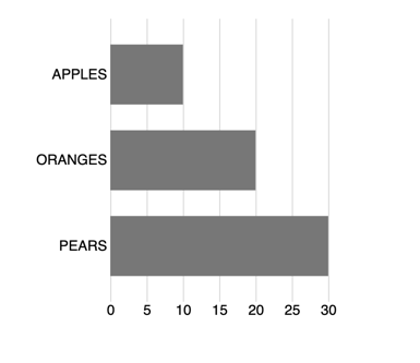
The first thing we are going to style are the bar fill colors. Using the viz.getStyle()method will allow us to leverage vizuly’s built in dynamic styles which will automatically determine if it is a static value or a dynamic function. The power of this little bit of code can not be overstated when it comes to data visualization work and using data bound logic and conditions to modify the appearance of a component in a succinct and expressive way. Right now with our current style set to bar-fill: '#777'our component will look like this:
But, with just a little bit of code in our application:
viz.style('bar-fill', function (d, i) {
 return ['#FF5252', '#FFA000', '#38B51A'][i]
})
We can make it look like this:
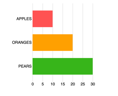
Think of these styles as javascript enabled CSS, which on the surface doesn’t sound like that big of deal, but when it comes to data visualization work it can become invaluable. With just a few lines of code we can dramatically change the appearance of a visualization based on our own data and logic — all without having to modify any component source code. This is the definition of reusabilty.
// Style the left axis
leftAxis
 .style('font-size', Math.round(size.height * .05) + 'px')
 .style('text-transform', 'uppercase')
 .selectAll('.domain')
 .style('fill', 'none')
 .style('stroke', 'none')

Style the bottom axis
bottomAxis
 .style('stroke-opacity', 0.15)
 .style('font-size', Math.round(size.height * .05) + 'px')
 .selectAll('.domain')
 .style('fill', 'none')
 .style('stroke', 'none')
Next up we will make some changes to the both the left and bottom axis to emphasize the labels with uppercaseand to dynamically size the fonts based on our component height. This dynamic font-sizing can be helpful when our components run at different display resolutions. When building components for commercial use, I usually will expose these font-size calculations as dynamic styles so if the user wishes to override these values they have an easy way to do so.
The final thing we do here, as in all our lifecycle functions, is to emit an event alerting the developer that this function has completed:
scope.dispatch.apply('styled', viz)
Now that we have initialized, measured, updated, and styled our component we only have a couple utilitarian tasks to complete. First we need to publicly expose our update()function so it can be accessed externally by the application developer. We do this by adding it to our factory generated vizobject and calling our internal update function.
viz.update = function () {
   update();
}
Because this publicly exposed method is not configured by the vizuly factory method, it gives component developers flexibility in how they want to structure their object lifecycle functions.
The final thing we need to do to wrap up our component is to return the vizgenerated by our factory method to the caller.
return viz;
If you remember, our MyBarChartis actually just a function and when a developer first instantiates it, we need to return an object for them to utilize like in the code below:
var chart = MyBarChart('#viz_container');
At the end of this article I have provided an example of all the above code in one single HTML file. Normally I would separate out the component code into its own javascript file, but in this case I am keeping it all together to make it easier to follow and experiment with.
There are a couple interesting things to note in the example below. First is how we use dynamic styles to color the bars as we showed earlier in this article with these lines of code:
.style('bar-fill', function (d, i) {
 return ['#FF5252', '#FFA000', '#38B51A'][i]
})
Next we have an event listener on the click event that will show us which bar has been clicked. As you can imagine, this could be really useful in an application where clicking on a bar could trigger some other UI/UX event.
.on('click', function (d, i) {
 console.log(d.label + ' clicked.')
})
The last thing we do is use our styledlifecycle event to color the labels of the vertical axis to match the bars. This is something we could have done in the component itself, but sometimes an application developer will want to make changes that the component developer did not anticipate and this is one way to do that. You will notice we are using the assigned class names provided by our component for the left-axisto drill into the svg generated by the d3 axis and then change the styles of the respective tick labels.
.on('styled', function () {
 chart.selection().selectAll('.left-axis .tick text')
   .style('fill', function (d, i) {
       return ['#FF5252', '#FFA000', '#38B51A'][i]
    }
   )
})
You can feel free to copy the gist below with all the example source code onto your local machine and play around with all of the examples described above.
I have also pre-built many standard charts (and a few advanced ones) using this method and have offered them to the community under an open source MIT license.
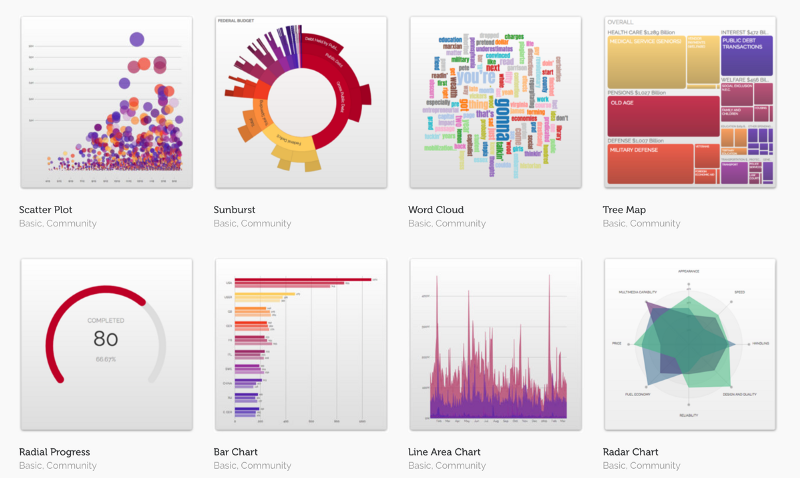
Above you will see a small sampling of some of these reusable components, which you are free to use on your own projects, you can find them here on github. You can also see them running live directly at Vizuly where you can adjust styles and properties on the fly from each components test container.
Comments