
 POLITICAL INFLUENCE
 MOBILE FINANCE
 FEDERAL BUDGET
Mobile Data Visualization Design
Design considerations for mobile form factors and devices
Almost three quarters of internet users will be mobile-only by 2025 — World Advertising Research Center
In its January 2019 report, The World Advertising Research Center predicts that 72% of the world internet users will be will mobile only by 2025. ComScore, a leading technology media analytics company, says that users total activity on smartphones and tablets accounts for an outstanding 60 percent of digital media time in the US, already surpassing the desktop. It is clear that mobile devices are becoming the primary way that users interact with digital content. What was traditionally performed on the desktop (email, calendars, web browsing, etc.) is now being performed on mobile devices. Each day more and more sophisticated tasks are being performed on mobile devices. What does this have to do with data visualization one might ask? A lot.
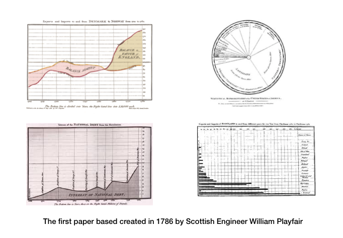
Data visualization has been around for centuries, since 1786 when the Scottish engineer and economist William Playfair published the first set of charts examining British Trade and debt from 1700–1782. From that time, until the invention of computers, the primary medium for data visualization was paper and ink. With the introduction of computer display monitors, a new way for humans to view and interact with data was born. Data was no longer limited to just a static view, it could also be interacted with dynamically.
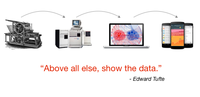
The best practices used in paper based static data visualizations that started in the late 1700’s, paved the way for the techniques used in desktop computers today. But as technology advances, so must the best practices and techniques for data visualization. We need to take the best of what worked well historically, and leverage capabilities of newer technology in order to add to the communicative value of the visualization.
Advances in technology can create new opportunities to communicate information but can also limit them. When personal computers first came to market, graphics processors and displays were far more limited than the rich graphics that could be made in print media, but it offered something new — user interaction. As desktop computers continued to advance, their ability to display data at ever finer resolutions surpassed that of paper based media. We are seeing the same shift in technology today as we move from desktop form factors to mobile devices.
Mobile devices give us ubiquitous access to information in ways that desktop and laptop computers never could, as they can travel on our person and can accessed in an instant. Modern smart phones also have given us a new way to manipulate user interfaces — with our fingers via touch technology. While these new modalities of user interaction offer fresh ways to view and interact with data, they also introduce some limitations that must be taken into account when designing interactive data visualizations.
Firstly, mobile form factors are small by their given nature. As such, there is simply less room to present information. It is a lot easier to show 10,000 data points on a 30″ desktop monitor than it is on a 4″ smart phone. Secondly, while touch interaction feels more natural and intuitive than the mouse/window paradigm, it is limiting. The computer mouse (and similar pointing devices) offer highly granular precision of movement. A mouse allows the user to precisely select a point on the screen that is the radius of just a few pixels. Touch interfaces, on the other hand, require a much larger target selection area in order to accommodate the size of a finger tip or thumb. In time, as mobile technology advances, many of these limitations may go away. But, for now, it is imperative we consider these limits when designing data visualizations for the mobile form factor.
In this article we will look at just one subset of data visualization, something that almost every person is familiar with, cartesian charts. Cartesian charts are the graphs we learned to create in grade school that plot data along an x and y axis such as your typical bar chart or line chart. These types of charts serve as a good case study for the challenges we face in creating data visualizations for the mobile form factor. While seemingly simple on the surface, creating truly effective and well designed cartesian charts for mobile devices can be deceptively challenging.
With this in mind, we will look at the common high level features of data visualization and interaction that can be accomplished on the desktop and use that as a baseline for the the feature-set we would like to see on a mobile device. If we are able to accomplish this, we will be allowing users to not only take advantage of mobility and touch interfaces, but also enjoy the features they have become accustomed to on their desktops.
Below is a list of a fundamental set of visualization and interaction capabilities that can be achieved on modern desktop. These capabilities build upon the best practices that were developed when data visualization relied upon paper and ink and was represented in a static format.
- Displaying Enough Data: A chart with only 20 data points not going to be nearly as comprehensive as one with over a 1000. In fact, if we can only display 20 data points a time, it will be hard for the user to spot any meaningful trends or patterns in the data. Screen real estate is at a premium on the mobile form factor. Unlike the average desktop where we have the luxury of over a million pixels, we have less than 20% of that screen real estate on the average mobile phone. Therefore, it is important that we can provide the users with a view into a reasonable amount of data.
- Zooming in and Out: Providing a way to transition from a high level overview to a more detailed view and back again is important when trying to analyze overall trending information and the details beneath those trends. For instance, looking at stock market data across years, months, and days gives the user high level trending information and detailed granular data.
- Data Point Selection and Details: User’s need a way to select specific data points within a series of data and get related information. As an example, when a user is looking at a stock price trend over a year long period they would also want to be able to select a point on the trend line and see the price for a given day. In addition, the user may also want to see the high, low, open, close, and volume of the stock for the same day. This ability, to select a given data point and see the details of the data, is especially important when you are limited to how many pixels you have to represent chart information.
The goal of any good data visualization is to effectively communicate the meaning of the data it is representing. In conjunction with this, the user interactivity should be natural and intuitive. Unless the data visualization is highly specialized and complex, it is best to stick to visual and interaction metaphors that the user is already familiar with. Touch interfaces on mobile devices have introduced new user interaction patterns, via finger gestures, that now feel natural and intuitive to users. In designing data visualization interactions we want to leverage these same gesture based interactions.
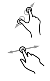
Pinch and Zoom: One of the common gestures of all touch interfaces is the ability to zoom in and out by pinching or expanding two fingers on the surface of the touch device. The most common use case for this gesture is for looking at images or other media that can be made larger and smaller.
Drag and Scroll: Scrolling a list or document on a mobile device is usually achieved by using one finger to drag the item vertically or horizontally to scroll across the view. This is another gesture that people use so often that it has become second nature.
When viewing photos on a smart phone, users often want to see details that aren’t immediately obvious, like the expression on a face, or the intricate shape and colors of a flower. Similar to using a magnifying glass, users intuitively take their fingers, put them on the glass surface of the device and spread them apart. Almost magically, the photo zooms in at the exact spot where both of their fingers originally touched the surface, showing details not previously seen. Incorporating this gesture with data visualizations offers the user a powerful way to zoom in on the data itself, much like they do with a photo. The best way to achieve this effect is by allowing the user to directly manipulate the chart itself. When the user puts their fingers on a specific point in the chart and spreads them apart, the chart should expand from this center point to show a closer view of the data. This technique allows the user to dynamically adjust how much data they are viewing at any one time.
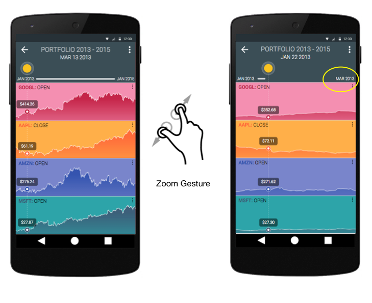
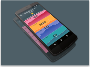
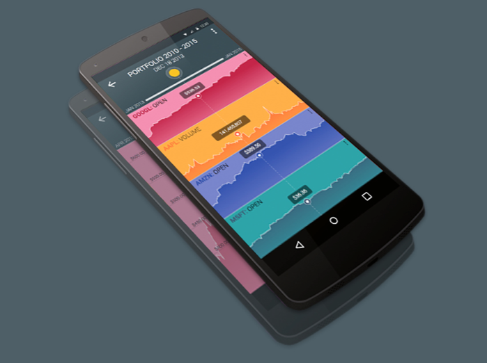
For pinch/zoom interactions it is important that the user experience be responsive and smooth, any delay or jumpiness in the display response will be jarring and undermine the effectiveness of the interaction. It is also important to give the user visual cues to show how their interaction has changed the data view. The two figures above show the before and after state of a zoom gesture. On the left, the 4 charts are zoomed all the way out — showing an overview of 2 years of stock prices. On the right, after the user has spread their fingers apart on the surface, the user sees a zoomed in view, showing just two months of data. Effectively, the minimum and maximum values of the x-axis have changed. This change allows more detailed data to be shown in the same space. Instead of seeing things on a monthly basis the user can now see things on a daily basis.
The user is also given additional visual indicators that the view into the data has changed. These indicators are secondary to the main animation, but help to give the user a reference point into the data view. In the first figure we see that the two date labels on either side of the scroll bar, above the four charts, have changed and from JAN 2013 and JAN 2015 to JAN 2013 and MAR 2013 as a result of their zoom gesture. Another indicator that gives the user a graphical perspective of their current view is the scroll bar we see atop of the 4 charts. As the user zooms in and out, the scroll bar shrinks and expands. A scroll bar is a very familiar UI metaphor that carries over from the desktop and can be used to help orient the user to their current view of the data.
In conjunction to allowing the user to zoom in and out on data, the user needs a way to pan (scroll) across the data when it has been zoomed in upon. In this case we can use a simple drag or swipe gesture to scroll the chart left or right as seen below. By placing their finger directly on the chart, the user can drag the chart left or right, panning across the data.
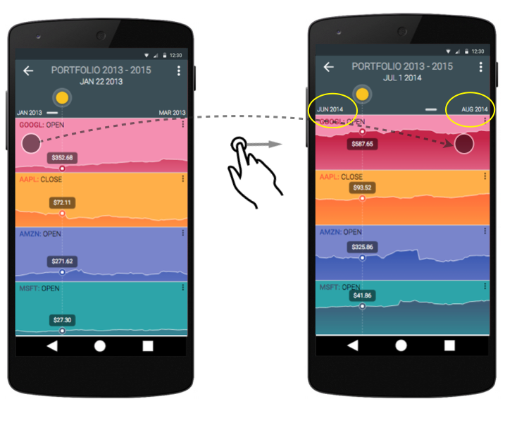
When the user drags the chart in either direction, the scroll bar moves — indicating the direction and distance the user has panned across the data. The chart still only shows a two month window of the stock market prices (based on the zoom operation they performed) but we now see that the date range for this view has changed from JAN 2013 through MAR 2013 to JUN 2014 to AUG 2014. It is important that the visual feedback to the user be smooth and responsive. So as the user drags their finger to scroll the chart that the chart responds smoothly and in pace with the swipe.
The combination of zooming in and out with the ability to pan across the data allow us to represent a significant amount of information to the user within a mobile form factor. It is not unrealistic to represent thousands of interpolated data points zoomed out, while allowing the user to zoom in and see the detail of each specific piece of data. These two techniques implemented in such a way, overcome the limitation of working with a much smaller display while at the same time taking advantage of the intuitive touch interface.
Data point selection is another fundamental feature that is necessary for the user to see specific and related details of a single data point. Unlike the fine precision that can be achieved with a mouse pointer, finger gestures provide a much less precise way to interact with the display surface. This can prove problematic when a user wants to select one data point out of many that may be clustered around a small region of the screen. Traditional desktop user interaction patterns fail us here — as most have been tailored around the precision of the mouse. Thus, new ways to interact with numerous or closely spaced data points need to be developed. Below we will discuss the “highlight and select” interaction pattern that combines two different display and gesture techniques.
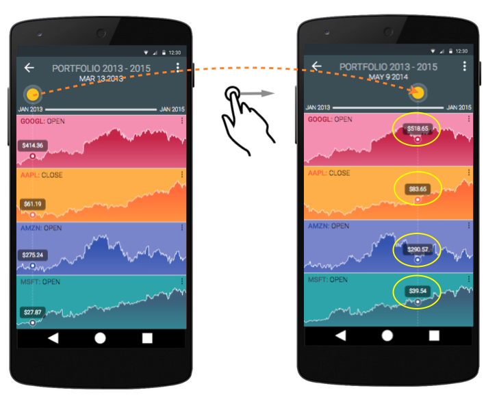
One of the interaction patterns is the finger sized draggable slider. The slider highlights specific data points while also being responsive enough to provide the user fine control of what data points are being highlighted is one of these interaction patterns.
As seen in the example below, the user can drag the indicator horizontally across the screen with their finger. As they do so, relevant data points are highlighted in all 4 charts. As the user zooms in on the data and the data points get spaced further apart, they gain a finer control of how quickly the indicator will move across the data.

Because the handle for the draggable slider is positioned outside of the chart itself, it avoids the situation where the user’s finger could occlude the data that is being highlighted. This technique works well for a single chart, multiple charts (as shown above), or multiple series within a single chart. Additional layout logic for highlight label positioning sometimes needs to be employed when multiple data points are clustered closely together.
In conjunction with highlighting a specific data point, users will often want to see detailed or supplemental information to that specific piece of data. In desktop solutions this is usually accomplished via a tool tip that appears when the mouse is over a point and disappears when the mouse leaves that point. Unfortunately, on a touch surface, there is no analogous interaction to the “mouse-over” as seen on the desktop. Instead, we need to devise an intuitive touch interaction that will allow the user to see related information to a highlighted data tip while not detracting from the overall communicative value of the chart.
One solution that works well, is to show a tool tip when the user has tapped on the data point. This gesture requires the user to be more deliberate in their analysis than a mouse-over on the desktop, and while not as responsive or automatic as a mouse-over, it is a good compromise. As seen above, when the user taps on the indicator label, a tool tip is shown that displays more information about that data point. Since we want to make the user experience as seamless as possible, we will have the tool tip automatically disappear when the user next interacts with the display.
Sometimes it is helpful to create a link or other interactive display element in the tool tip that will display more comprehensive and detailed information related to that specific piece of data. In this case, a link or some other call to action can be displayed within the tool tip itself which allows the user to tap on that UI element thus launching a different screen or changing the state of the display. In the tool tip above we can see that the “GOOGLE INC” label shows up as a hyperlink that can launch a separate browser window with financial details about Google.
It is important to note when engineering these tap interactions with web based technologies, that the developer take into account how mobile browsers respond to a user tap. As explained in this article “The 300 ms Click Delay and iOS 8”, mobile browsers implement the “tap” gesture differently. In addition, the user will need to have the application listen for the user’s next gesture event so the tool tip can be removed from the display.
The Highlight and Select pattern seen here, as implemented via the drag slider and tap gesture, is a great way to allow the user to see the details of a specific data point as well as related information. Both of these visualization interactions are much different than what is typically seen on the desktop, but interestingly, would work very well on the desktop, with the simple substitution of a mouse click instead of a touch tap.
Pinch, zoom, drag and tap form the fundamentals of the new lexicon for mobile user interactions. The transition between the desktop and mobile devices for data visualization is much more than simply making smaller charts with the same user experience metaphors. It is important to take both the smaller form factor, and new user interactions into account when designing charts and data visualizations for mobile devices. In fact, it can be argued that both the new form factor and touch interface become paramount to the design choices one makes for mobile charting and visualization.
The idea of minimizing “chart junk”, a phrase fist coined by Edward Tufte in his 1983 book The Visual Display of Quantitative Information, is even more relevant when it comes to designing for mobile devices. Every pixel counts, and any information displayed to the user has to reinforce the primary purpose of the chart. A good mobile design that takes these design principles into account will often translate well to larger form factors. The smaller display space and less precise pointer control found on a mobile device necessitate a focus on the fundamental design principles of good data visualization and interaction.
Comments