
 POLITICAL INFLUENCE
 FEDERAL BUDGET
Dashboard Design: Key Performance Indicators and Metrics

How to select the right data for your Dashboard
The most important aspect of designing an effective dashboard is making sure you have selected the right metrics and KPI’s to display. No matter how stunning or clever a visual design is, if it isn’t displaying meaningful insights and data relevant to its audience it will end up being just a pretty display that no one looks at.
This article will show you some proven techniques that will help you to collect and define appropriate performance indicators for executive and operational dashboards. While the techniques discussed here are focused on dashboard design, these same principles can be used across many different business intelligence requirements gathering efforts.
With the prevalence of dashboard tools and displays seen in widely varied software offerings, people have different understandings of what a dashboard, metric, and key performance indicator (KPI) consist of. To make sure we are all speaking the same language, I will define a set of terms that will form the basis of our design discussion.

Metrics and Key Performance Indicators
Metrics and KPIs are the building blocks of many dashboard visualizations; as they are the most effective means of alerting users as to where they are in relationship to their objectives. The definitions below form the basic building blocks for dashboard information design and they build upon themselves so it is important that you fully understand each definition and the concepts discussed before moving on to the next definition.
Measure: A measure is numerically quantifiable piece of data. Sales, Profit, Retention Rate, are all examples of specific measures.
Dimension: A dimension represents different facets of a given measure. For instance, timeis often used as a dimension to analyze different measures. Some other common dimensions are region, product, division, market segment, etc.
Hierarchy :Dimensions can be further broken down into hierarchies. For instance the timedimension may also form a hierarchy such as Year > Quarter > Month > Day.
Grain: Each of level within the hierarchy is referred to as the grainof the dimension. For example, if you were looking at a Geography dimension, the individual grains (levels) might be Region > Country > State/Province > City > Postal Code
Metric: A metric, which is the type of data we are often displaying in a dashboard, is a measure that represents a piece of data in relationship to one or more specific dimensions andassociatedgrains.
Gross Sales by Weekis an example of a metric. In this case, the measurewould be dollars (gross sales) and the dimensionwould be time with the associated grain(week.)
Looking at a measure across more than one dimension such as gross sales by territory andtime is called multi-dimensional analysis. Designing dashboards for multi-dimensional analysis can add significant complexity to your dashboard design and user experience due to the fact we are using a two dimensional surface (device screen) to represent multiple dimensions. While there are effective layout and interaction patterns to handle this type of analysis, it is important to make note of that prior to your design phase as these types of designs require more sophisticated approaches.

Key Performance Indicators (KPI): A KPI is simply a metricthat is tied to a target. Most often a KPI represents how far a metric is above or below a pre-determined threshold. KPI’s usually are shown as a ratio of actual to target and are designed to instantly let a business user know if they are on or off their plan without the end user having to consciously focus on the metrics being represented.
For instance, we might decide that in order to hit our quarterly sales target we need to be selling $10,000 of widgets per week. The metric would be widget sales per week, the target would be $10,000. If we used a percentage gauge visualization to represent this KPI and we had sold $8,000 in widgets by Wednesday, the user would instantly see that they were at 80% of their goal.
When selecting targets for your KPI’s, you need to remember that a target will have to exist for every grainyou want to view within a metric. Having a dashboard that displays a KPI for gross sales by day, week, and month will require that you have identified targets for each of these associated grains.
Scorecards, Dashboards, and Reports
The difference between a scorecard, dashboard, and report can be one of fine distinctions. Each of these tools can combine elements of the other, but at a high level they all target distinct and separate levels of the business decision making process.
Scorecards: Starting at the highest, most strategic level of the business decision making spectrum, we have scorecards. Scorecards are primarily used to help align operational execution with business strategy. The goal of a scorecard is to keep the business focused on a common strategic plan by monitoring real world execution and mapping the results of that execution back to a specific strategy. The primary measurement used in a scorecard is the key performance indicator. These key performance indicators are often a composite of several metrics or other KPIs that measure the organizations ability to execute a strategic objective. An example of a scorecard KPI would be an indicator named “Profitable Sales Growth” that combines several weighted measures such as: new customer acquisition, sales volume, and gross profitability into one final score.
Dashboards:A dashboard falls one level down in the business decision making process from a scorecard; as it is less focused on a strategic objective and more tied to specific operational goals. An operational goal may directly contribute to one or more higher level strategic objectives. Within a dashboard, execution of the operational goal itself becomes the focus, not the higher level strategy. The purpose of a dashboard is to provide the user with actionable business information in a format that is both intuitive and insightful. Dashboards leverage operational data primarily in the form of metrics and KPIs.
Reports:Probably the most prevalent BI tool seen in business is the traditional report. Reports can be very simple and static in nature, such as a list of sales transaction for a given time period, to more sophisticated cross-tab reports with nested grouping, rolling summaries, and dynamic drill-through or linking. Reports are best used when the user needs to look at raw data in an easy to read format. When combined with scorecards and dashboards, reports offer a tremendous way to allow users to analyze the specific data underlying their metrics and key performance indicators.

Gathering KPI and Metric Requirements for a Dashboard:
Traditional BI projects will often use a bottom-up approach in determining requirements, where the focus is on the domain of data and the relationships that exist within that data. When collecting metrics and KPIs for your dashboard project you will want to take a top-down approach. A top-down approach starts with the business objectives and decisions that need to be made first and then works its way down into the data needed to support those decisions.
In order to take a top down approach you MUSTinvolve the actual business users who will be utilizing these dashboards, as these are the only people who can determine the relevancy of specific business data to their decision making process.
When interviewing business users or stakeholders, the goal is to uncover the metrics and KPI’s that lead the user to a specific decision or action. Sometimes users will have a very detailed understanding of what data is important to them, and sometimes they will only have a high level set of goals. By following the practices outlined below, you will be able to distill the information provided to you by the user into a specific set of KPIs and metrics for your dashboards.
Interviewing Business Users:
In our experience working directly with clients and gathering requirements for executive and operational dashboard projects in a variety of industries, we have found that the interview process revolves around two simple questions: “What business questions do you need answers to, and once you have those answers what action would you take or what decision would you make?”
Question 1: “What business questions do you need answers to?”
The purpose here is to help the business user define their requirements in a way that allows us to get to the data behind their question. For instance, a VP of sales might have the question: “Which sales people are my top producers?”or “Are we on target for the month?”In the case of the question “Which sales people are my top producers?” we might then follow up with a couple of questions for the VP and ask her “Would this measure be based on gross sales? Would you like to see this daily, weekly, or monthly?”
We want to identify the specific data components that will make up the KPI or metric. So we need to spend enough time with the user discussing the question until we clearly understand the measure, dimension, grain, and target(in the case of a KPI) that will be represented.
Question 2: “Based on the answer to Question 1, what other questions would this raise or what action would you take?”
Once we understand the metric or KPI that is needed to answer the user’s question, we then need to find out if the user would want to perform further analysis based on that answer, or if they would be able to take an action or make a decision. The goal is to have the user keep breaking down the question until they have enough information to take action or make a decision. This process of drilling deeper into the question can be analogous to peeling back the layers of an onion; we want to keep going deeper until we have gotten to the core, which in this case is the user’s ability to make a decision or take action.
As a result of this iterative two part question process we are going to quickly filter out the metrics and KPIs that could be considered just interesting from the ones that are truly critical to the user’s decision making process. This approach is counter to what I call the “kitchen sink approach” to dashboard development, where the product and/or engineering team design a dashboard with every available piece of data and complex widgets that will allow the user to search, filter, and or drill their way into the data they need.
Taking a kitchen sink approach to dashboard design will more often than not just overwhelm your users with too many choices and cognitive load that results in a dashboard that does not get used. Conversely, presenting data that is tightly targeted to what a user needs to see and make decisions on to improve the business condition will result in a highly effective and widely used dashboard.
Putting it all together — The KPI Wheel
In order to help with this requirements interview process, I have created a simple tool called the KPI Wheel. The interview process is very rarely a structured linear conversation, and more often is an organic free-flowing exchange of ideas and questions. The KPI Wheel allows us to have a naturally flowing conversation with the end-user while at the same time keeping us focused on the goal of gathering specific requirements.
I recommend printing out the image below on several pieces of paper and having them handy for your user interviews where you can write your notes directly on the wheel.
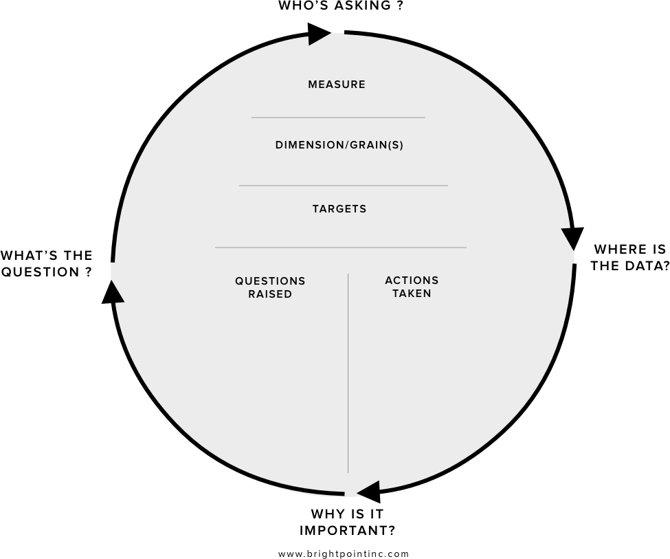
The KPI Wheel is tool that can be used to collect all the specific information that will go into defining and visualizing a metric or KPI. We will use this tool to collect the following information:
- The business question that we are trying to help the user answer.
- Which business users this question would apply to.
- Why the question is important to business objectives.
- Where data resides to answer this question.
- What further questions this metric or KPI could raise.
- What actions or decisions could be taken with this information
Start anywhere, but go everywhere
The KPI Wheel is designed as a circle because it embodies the concept that you can start anywhere but go everywhere, thus covering all relevant areas. In the course of an interview session you will want to refer to the wheel to make sure you are filling in each area, as they are discussed. As your conversation flows you can simply jot down notes in the appropriate section, and you can make sure to follow up with more questions if some areas remain unfilled. The beauty behind this approach is that a user can start out very high level “I want to see how sales are doing” or at a very low level “I need to see product sales broken down by region, time, and gross margins.” In either scenario, you are able to start at whatever point the user feels comfortable and then move around the wheel filling in the needed details.
Question 1: What’s The Question?
This area of the wheel refers to the basic “What business question do you need an answer to?” We can often start the interview with this question, or we can circle back to it when the user starts off with a specific metric in mind by asking them “What business question would that metric answer for you?” This segment of the wheel drives the overall context and relevance of the whole metric or KPI.
Question 2: Who’s Asking?
For a given metric we want to know who will be using this information to make decisions and take action. It is important to understand the various users within the organization that may be viewing this metric. We can either take note of specific individuals or just refer to a general group of people who would all have similar business needs.
Question 3: Why is it Important?
Because a truly effective dashboard can become a tool that is used every day, we want to validate the importance of each metric and KPI that is displayed. Often times in going through this requirements gathering process we will collect a long list of potential metrics and KPIs, and at some point the user will have to make a choice about what data is truly the most important for them to see on a regular basis. I suggest using a 1–10 scale in conjunction with a description of why the metric is important so when you begin your dashboard prototyping you will have context as to the importance of this metric.
Question 4: Data Sources
For a given metric or KPI we also want to identify where the supporting data will come from. Sometimes in order to calculate a metric along one or more dimensions we need to aggregate data from several different sources. In the case of the metric “Top Selling products by gross margins” we may need to pull data from both a CRM system and an ERP system. At this stage it is good enough to simply indicate the business system that holds the data; it is unnecessary to dive into actual table/field name descriptions at this point.
Upper Half: Measures, Dimensions, and Targets
We want to make sure that we have captured the three main attributes that create a metric or KPI, and have the user validate the grains of any given dimensions. If we are unable to pin down the measure and dimension for a metric, and/or the target for a KPI then we will be unable to collect and visualize that data when it comes time to designing our dashboard.
Lower Half: Questions Raised
In this section of the KPI wheel we want to list any other questions that may be raised when we have answered our primary question. This list can serve as the basis for the creation of subsequent KPI Wheels that are used for definition of further metrics and KPIs.
Lower Half: Actions to be Taken
For any given metric or KPI we want to understand what types of decisions can be made or what types of actions will be take depending on the state of the measurement. By filling out this section we are also able to help validate the importance of the metric and separate the “must-have” KPI from the “nice-to-have” KPI.
Wheels generate other wheels
In filling out a KPI Wheel the process will often generate the need for several more KPI’s and metrics. This is one of the purposes of doing an initial analysis in the first place; to bring all of the user’s needs up to the surface. As you work through this requirements gathering effort you will find that there is no right path to getting your answers, questions will raise other questions, and you will end up circling back and covering ground already discussed in a new light. It is important to be patient, and keep an open mind as this is a process of discovery. The goal is to have a concrete understanding of how you can empower the user through the use of good metrics and KPIs.

As you start to collect a thick stack of KPI Wheels you will begin to see relationships between the KPIs you have collected. When you feel that you have reached a saturation point and neither you nor the user can think of any more meaningful measurements, you will then want to review all the KPI Wheels in context with each other. It is a good practice to aggregate the KPIs and create logical groupings and hierarchies so you clearly understand the relationships that exist between various metrics. Once these steps have been accomplished you will have a solid foundation to start you dashboard visualization and design process upon.
A word about gathering requirements and business users
Spending the needed time with a formal requirements gathering process is often something not well understood by business users, especially senior executives. This process will sometimes be viewed as a lot of unnecessary busy work that interrupts the user’s already hectic day. It is important to remember that the decisions you are making now about what data is and is not relevant will have to be done at some point, and the only one who can make this determination is the user himself. The question is whether you spend the time to make those fundamental decisions now, while you are simply moving around ideas, or later after you have painstakingly designed the dashboards and built complex data integration services around them.
As with all software development projects, the cost of change grows exponentially as you move through each stage of the development cycle. A great analogy is the one used for home construction. What is the cost to move a wall when it is a line on a drawing, versus the cost to move it after you have hung a picture on it?
Wrapping it all up
While this article touches upon some of the fundamental building blocks that can be used in gathering requirements for a dashboard project, it is by no means a comprehensive methodology. Every business intelligence architect has a set of best practices and design patterns they use when creating a new solution. I hope that some of the processes I have mentioned here can be adapted and used to supplement your current best practices for a variety of solutions that leverage dashboarding technologies.
Comments