
 POLITICAL INFLUENCE
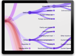 FEDERAL BUDGET
Political Influence
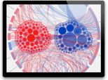
This visualization looks at the monetary contributions made by the top 20 Political Action Committees (PAC) for the 2012 congressional election cycle, both for the House of Representatives and the Senate. The goal was to depict how intertwined special interests groups and our political representatives are.
Each inner circle represents a member of congress, blue is democrat, red is republican, and gold is independent. The larger the circle, the more funds that member has received. Each arc along the circumference is one of the top 20 PAC’s. Each section of the arc and corresponding chord that connects to a member’s circle represents a specific donation on a given date. As the diagram animates it shows cumulative funding over the period of a year. Use your mouse to roll-over each element to see how everything is connected. Source Code Available Here
[…] custom chore diagram titled Political Influence [brightpointinc.com] highlights the monetary contributions made by the top Political Action […]