
 POLITICAL INFLUENCE
 FEDERAL BUDGET
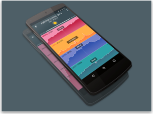
Dashboard Design: Executive Dashboards Part 1
| Column published BrightPoint Consulting, Inc. | |
| By Tom Gonzalez |
Introduction:
Corporate dashboards are becoming the must have business intelligence technology for executives and business users across corporate America. Dashboard solutions have been around for over a decade, but have recently seen a resurgence in popularity due to the advance of enabling business intelligence and integration technologies.
Designing an effective business dashboard is more challenging than it might appear due to the fact you are compressing large amounts of business information into a small visual area. Every dashboard component must effectively balance its share of screen real estate with the importance of the information it is imparting to the viewer.
This article will discuss how to create an effective operational dashboard and some of the associated design best practices.
Dashboard Design Goals:
Dashboards can take many formats, from glorified reports to highly strategic business scorecards. This article refers to operational or tactical dashboards employed by business users in performing their daily work; these dashboards may directly support higher-level strategic objectives or be tied to a very specific business function. The goal of an operational dashboard is to provide business users with relevant and actionable information that empowers them to make effective decisions in a more efficient manner than they could without a dashboard. In this context, relevant means information that is directly tied to the user’s role and level within the organization. For instance, it would be inappropriate to provide the CFO with detailed metrics about Web site traffic but appropriate to present usage costs as they relate to bandwidth consumption.
Actionable information refers to data that will alert the user as to when and what type of action needs to be taken in order to meet operational or strategic targets. Effective dashboards require an extremely efficient design that takes into account the role a user plays within the organization and the specific tasks and responsibilities that user performs on a daily/weekly basis.
Defining Key Performance Indicators:
The first step in designing a dashboard is to understand what key performance indicators (KPI) users are responsible for and which KPI’s they wish to manage through their dashboard solution. A KPI can be defined as a measure (real or abstract) that indicates relative performance in relationship to a target goal. For instance, we might have a KPI that measures a specific number, such as daily Internet sales with a target goal of $10,000. In another instance we might have a more abstract KPI that measures financial health as a composite of several other KPIs, such as outstanding receivables, available credit and earnings before tax and depreciation. Within this scenario the higher-level financial KPI would be a composite of three disparate measures and their relative performance to specific targets. Defining the correct KPIs specific to the intended user is one of the most important design steps, as it sets the foundation and context for the information that will be subsequently visualized within the dashboard.
Defining Supporting analytics:
In addition to defining your KPIs, it is helpful to identify the information a user will want to see in order to diagnose the condition of a given KPI. We refer to this non-KPI information as supporting analytics as it provides context and diagnostic information for end users in helping to understand why a KPI is in a given state. Often times, these supporting analytics take the form of more traditional data visualization representations such as charts, graphs, tables and, with more advanced data visualization packages, animated what-if or predictive analysis scenarios.
For each KPI on a given dashboard you should decide if you want to provide supporting analytics and, if so, what type of information would be needed to support analysis of that KPI. For instance, in the case of a KPI reporting on aging receivables, you might want to provide the user a list of accounts due with balances past 90 days. In this case when a user sees that the aging KPI is trending in the wrong direction he/she could click on a supporting analytics icon to bring up a table of accounts due sorted by balance outstanding. This information would then support the user in his/her ability to decide what, if any, action needed to be taken in relationship to the condition of the KPI.
Choosing the Correct KPI Visualization Components:
Dashboard visualization components fall into two main categories: key performance indicators and supporting analytics. In either case,
it is important to choose the visualization that best meets the end users need in relationship to the information they are monitoring or analyzing.
For KPIs there are five common visualizations used in most dashboard solutions. The following lists each component’s relative merits and common usage scenario.
1. Alert Icons:
The simplest visualization is perhaps an alert icon, which can be a geometric shape that is either color-coded or shaded various patterns based on its state. Potentially, the most recognizable alert icon is a green, yellow or red circle, whereby the color represents a more or less desirable condition for the KPI.
When to use: These types of visualizations are best used when they are placed in the context of other supporting information, or when you need a dense cluster of indicators that are clearly labeled. Traditional business scorecard dashboards that are laid out in table like format can benefit from this visualization, whereby other adjacent columns of information can be analyzed depending on the state of the alert icon. These types of icons are also useful in reporting on system state, such as whether a machine or application is online or not. Be cautious of using icons that depend exclusively on color to differentiate state, as 10 percent of the male population and 1 percent of the female population is color-blind; consider using shapes in conjunction with color to differentiate state.
2. Traffic Light Icons:
The traffic light is a simple extension of the alert icon, and has little advantage over the alert icon in terms of data visualization. Like the alert icon, this component only offers one dimension of information, but it requires 300 percent of the screen real estate. The one advantage of the traffic light icon is that it is a more widely recognized symbol of communicating a good state, warning state or bad state.
When to use: In most cases a simple alert icon is a more efficient visualization, but in situations where your dashboard is being used by a wide audience on a less frequent basis, a traffic light component will allow users to more quickly assimilate the alert information due to their familiarity with the traffic light symbol from real world experience.
3. Trend Icons:
A trend icon represents how a key performance indicator or metric is behaving over a period of time. It can be in one of three states: moving toward a target, away from a target, or static. Various symbols may be used to represent these states, including arrows or numbers. Trend icons can be combined with alert icons to display two dimensions of information within the same visual space. This can be accomplished by placing the trend icon within a color- or shape-coded alert icon.
When to use: Trend icons can be used by themselves in the same situation you would use an alert icon, or to supplement another more complex KPI visualization when you want to provide a reference to the KPI’s movement over time.
4. Progress Bars:
A progress bar represents more than one dimension of information about a KPI via its scale, color and limits. At its most basic level a progress bar can provide a visual representation of progress along a one-dimensional axis. With the addition of color and alert levels, you can also indicate when you have crossed specific target thresholds as well as how close you are to a specific limit.
When to use: Progress bars are primarily used to represent a relative progress toward a positive quantity of a real number. They do not work well when the measure you want to represent can have negative values: The use of shading within a bar to represent a negative value can be confusing to the viewer as any shading is seen to represent some value above zero regardless of the label on the axis. Progress bars also work well when you have KPIs or metrics that share a common measure along an axis (similar to a bar chart) and you want to see relative performance across those KPIs/metrics.
5. Gauges:
A gauge is an excellent mechanism by which to quickly assess both positive and negative values along a relative scale. Gauges lend themselves to dynamic data that can change over time in relationship to underlying variables. Additionally, the use of embedded alert levels allows you to quickly see how close or far away you are from a specific threshold.
When to use: Gauges should be reserved for the highest level and most critical metrics or KPIs on a dashboard because of their visual density and tendency to focus user attention. Most of these critical operational metrics/KPIs will be more dynamic values that change on a frequent basis throughout the day. One of the most important considerations in using gauges is their size: too small and it is difficult for the viewer to discern relative values due to the density of the ink used to represent the various gauge components; too large and you end up wasting valuable screen space. With more sophisticated data visualization packages, gauges also serve as excellent context-sensitive navigation elements due to their visual predominance within the dashboard.
In Part 2 of this series we will talk about how to design supporting analytics, make your dashboard interactive, and create a visually compelling layout that is both engaging and efficient.
About Thomas W. Gonzalez:
Mr. Gonzalez is the founder and Managing Director of BrightPoint Consulting, Inc, serving as a consultant to both fortune 500 companies and small-medium businesses alike. With over 20 years experience in developing business software applications, Mr. Gonzalez is a recognized expert in the fields of data visualization and software design.
References:
Tractinsky, Noam
“Aesthetics and Apparent Usability: Empirically Assessing Cultural and
Methodological Issues” Association for Computing Machinery, Inc.,
1997
Tufte, Edward
Envisioning Information Graphics Press, 1990
Fitts, P.M.
(1954). “The information capacity of the human motor system in controlling
the amplitude of movement.” Journal of Experimental Psychology, 47,
381-391
Comments