
 POLITICAL INFLUENCE
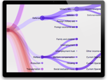 FEDERAL BUDGET
Federal Budget
When politicians talk about “spending” have you ever wanted to know where our tax dollars actually go? This visualization that was assembled with publicly available data from the Congressional Budget Office (www.cbo.gov) lets you do exactly that. The goal of this visualization is to allow a user to quickly see the major flows of spending in our government, at the federal, state, and local level. It’s interesting to see the relationship of spending between education and defense at both the Federal and Local level.
[…] hierarchical browser 2013 Federal Budget [brightpointinc.com] reveals the major flows of spending in the US government, at the federal, […]
[…] example of an interactive visualisation is Brightpoint Consulting’s 2013 US Federal Budget. This visualisation effectively reveals the major areas of spending by the US government and […]
How do you change the orientation of this map i.e. from the current vertical to horizontal.
Hi. You will want to swap the x,y on the diagonal projection. https://github.com/mbostock/d3/wiki/SVG-Shapes#diagonal_projection
Thank you tom
How can I change color for all three levels?
[…] US Federal Budget […]