
 POLITICAL INFLUENCE
 FEDERAL BUDGET
Dashboard Design: Executive Dashboards Part 2
| Column published BrightPoint Consulting, Inc. | |
| By Tom Gonzalez |
Introduction:
In part one of this series we covered the basic requirements of a corporate dashboard solution and went on to discuss the first steps of the dashboard design process. The two main areas covered were determining the appropriate key performance indicators (KPIs) and how to design a dashboard with the five most common KPI visualizations: alert icons, traffic lights, trend icons, progress bars, and gauges. In this article we complete the design process and cover visualization of supporting analytics and the layout techniques used to create a visually efficient and compelling design.
Supporting Analytics:
Supporting analytics are additional data visualizations that a user can view to help diagnose the condition of a given KPI or set of KPI’s. In most business cases these supporting analytics take the form of traditional charts and tables or lists. While the scope of this article is not intended to cover the myriad of best practices in designing traditional charting visualizations, we will discuss some of the basics as they relate to dashboard design.
When creating supporting analytics, it is paramount that you take into account the typical end user who will be viewing the dashboard. The more specialized and specific the dashboard will be the more complexity and detail you can have in your supporting analytics. Conversely, if you have a very high level dashboard your supporting analytics will generally represent higher level summary information with less complex detail.
Below we will discuss some of the most common visualizations used for designing supporting analytics.
1. Pie Charts: Pie charts are generally considered a poor data visualization for any data set with more than half a dozen elements. The problem with pie charts is that it is very difficult to discern proportional differences with a radially divided circle, except in the case of a small data set that has large value differences within it. Pie charts also pose a problem for labeling, as they are either dependent on a color or pattern to describe the different data elements, or the labels need to be arranged around the perimeter of the pie, creating a visual distraction. When to use: Pie charts should be used to represent very small data sets that are geared to high level relationships between data elements. Usually pie charts can work for summary level relationships but should not be used for detailed analysis
2. Bar Charts: Bar charts are an ideal visualization for showing the relationship of data elements within a series or multiple series. Bar charts allow for easy comparison of values due to the fact that the “bars” of data share a common measure and can be easily visually compared to one another.
When to use: Bar charts are best suited for categorical analysis but can also be used for small time series analysis (e.g. the months of a year.) An example of categorical analysis would be examining sales of products broken down by product or product group, with sales in dollars being the measure and product or product group being the category. Be careful in using bar charts if you have a data set that can have one element with a large outlier value; this will render the visualization for the remaining data elements unusable. This is due to the fact that the chart scale is linear and will not clearly represent the relationships between the remaining data elements. An example is below.
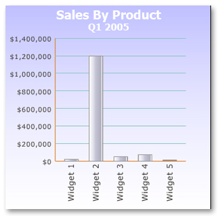
* Notice that due to the fact widget2 has sales of $1.2MM you can not easily discern that widget3 has twice as many sales ($46,000) as widget1 ($23,000).
3. Line Charts: Line charts are ideal for time series analysis where you want to see the progress of one or more measures over time. Line charts also allow for comparative trend analysis as you can stack multiple series of data into one chart.
When to use: Use line charts when you would like to see trends over time in a measure versus a side by side detailed comparison of data points. Time series line charts are most commonly used with the time dimension along the X axis and the data being measured along the Y axis.
4. Area Charts: Area charts can be considered a subset of the line chart, where the area under or above the line is shaded or colored. When to use: Area charts are good for simple comparisons with multiple series of data. By setting contrasting color hues you can easily compare the trends over time between two or more series.
5. Tables and Lists: Tables and lists are best used for information that either contains large lists of non numeric data, or data that has relationships not easily visualized. When to use: You will want to use tables or lists when the information you need to present does not lend itself to easy numeric analysis. One example would be a financial KPI that measures a company’s current liquidity ratio. In this case, there can be a complex interrelationship of line items within the companies balance sheet where a simple table of balance sheet line items would provide a more comprehensive supporting analytic than a series of detailed charts and graphs.
A word about labeling your charts and graphs: Chart labels are used to give the user context to the data they are looking at, both in terms of scale and content. The challenge with labeling is that the more labels you use and the more distinctive you make them, the more it will distract the user’s attention from the actual data being represented within the chart. When using labels, there are some important considerations to take into account. Foremost of these is how often your user will be viewing these charts. For charts being viewed on a more frequent basis, the user will form a memory of relevant labels and context. In these scenarios, you can be more conservative in your labeling by using smaller fonts and less color contrast. Conversely, if a user will only be seeing the chart occasionally you will want to make sure everything is labeled clearly so the user does not have to decipher the meaning of the chart.
Putting it all together; using size, contrast, and position:
The goal in laying out an effective dashboard is to have the most important business information be the first thing to grab your user’s visual attention. In your earlier design stages you already determined the important KPI’s and supporting analytics, so you can use this as your layout design guide. Size, contrast, and position all play a direct role in determining which visual elements will grab the user’s eye first.
Size: In most situations, the size of a visual element will play the largest role in how quickly the user will focus their attention upon it. In laying out your dashboard, figure out which element or group of elements will be the most important to the user and make their size proportionally larger than the rest of the elements on the dashboard. This principle holds true for single element or groups of common elements that have equal importance.
Contrast: After size, the color or shade contrast of a given element in relationship to its background will help determine the order in which the user focuses attention on that element. In some situations contrast alone will become the primary factor, even more so than size, as to where the user’s eye will gravitate. Contrast can be achieved by using different colors or saturation levels to distinguish a visual element from its background. A simple example of this can be seen in the screen below.
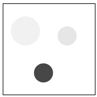
As you can see, the black circle instantly grabs the user’s attention due to the sharp contrast against the white background. In this example, the contrast even overrides the size of the larger circle in its ability to focus the user’s visual awareness.
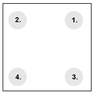
Position – Visual position also plays a role in where a user will focus their attention. All other factors being equal, the top right hand side of a rectangular area will be the user’s first focal point, as seen in the picture below. The next area a user will focus is the top left hand side, followed by the bottom right and finally the bottom left. Therefore if you need to put an element on the dashboard that you don’t want the user to have to hunt around for, the top right hand quadrant is generally the best place for it.
Position is also important when you want to create an association between visual elements. By placing elements in visual proximity to each other, and grouping them by color or lines, you can give an implied context and relationship between those elements. This is important in instances when you want to associate a given supporting analytic with a KPI or group together related supporting analytics.
Validating your design:
You will want to make sure that your incorporation of the above design techniques achieves the desired affect of focusing the user’s attention on the most important business information, and in the proper order. One way to see if you have achieved this successfully is to view your dashboard with an out of focus perspective. This can be done by stepping back from your dashboard and relaxing your focus until the dashboard becomes blurry and you can no longer read words or distinguish finer details. Your visual cortex will still recognize the overall visual patterns and you will easily see the most attention grabbing elements of your design. You want to validate that the elements attracting the most visual attention correspond with the KPI’s and supporting analytics that you had previously identified as being most critical to the business purpose of your dashboard.
Please bear in mind, the design guidelines presented in this article should be used as general rules of thumb, but it is important to note that these are not hard and fast rules that must be followed in every instance. Every dashboard has its own unique requirements, and in certain cases you will want to deviate from these guidelines and even contradict them to accomplish a specific visual effect or purpose.
References:
1. Tractinsky, Noam “Aesthetics and Apparent Usability: Empirically Assessing Cultural and Methodological Issues” Association for Computing Machinery, Inc., 1997
2. Tufte, Edward “Envisioning Information” Graphics Press, 1990
3. Fitts, P.M. (1954). “The information capacity of the human motor system in controlling the amplitude of movement.” Journal of Experimental Psychology, 47, 381-391
[…] clear chart titles and labels on each axis, consumption is next to impossible. Brightpoint recommends using simple labels to inform users about “content” and “scale,” […]
[…] clear chart titles and labels on each axis, consumption is next to impossible. Brightpoint recommends using simple labels to inform users about “content” and “scale,” […]